Next Digital catalogue
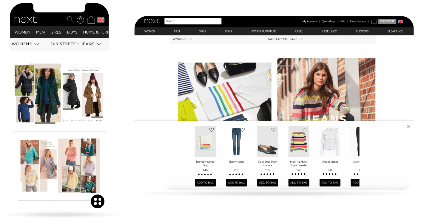

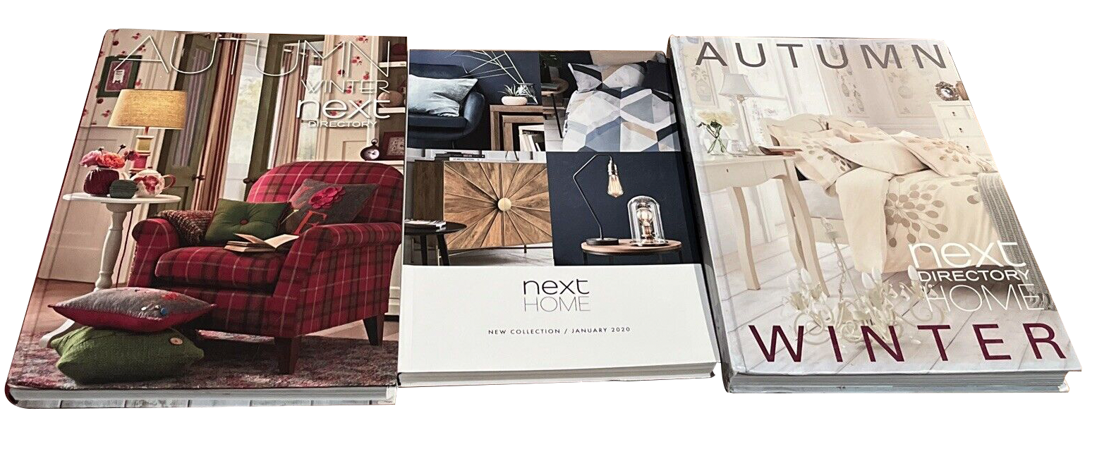
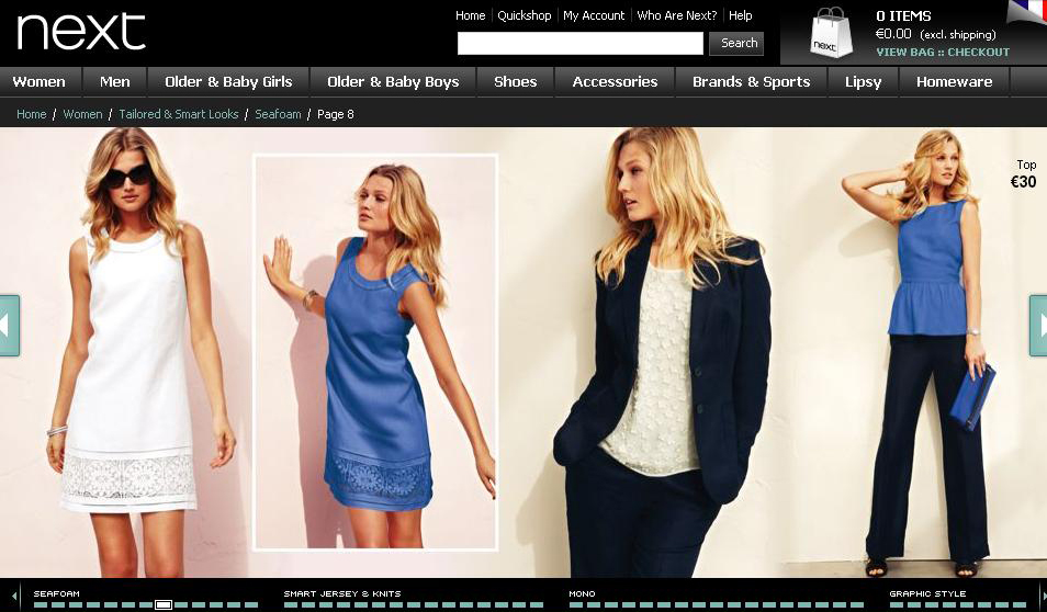
For many years, Next's well-known and highly regarded printed catalogue, the Next Directory, showcased care, precision and creativity across its many hundreds of crafted pages. While customers were highly satisfied with the catalogue, the transition to an online platform resulted in a disjointed user experience. While the printed catalogue was enthusiastically used by millions, the online version, though functional, paled in comparison.
The primary challenge was to revive and increase user engagement with the digital catalogue, which was experiencing low conversion rates and struggling with user retention. The continuous lack of user interest posed a significant obstacle. The business recognised the critical need to enhance the overall user experience, optimise product visibility, and implement a strategy to encourage repeat visits and conversions. Addressing these issues was paramount to unlocking the full potential of the digital catalogue and maximising its impact on the company's online sales performance.
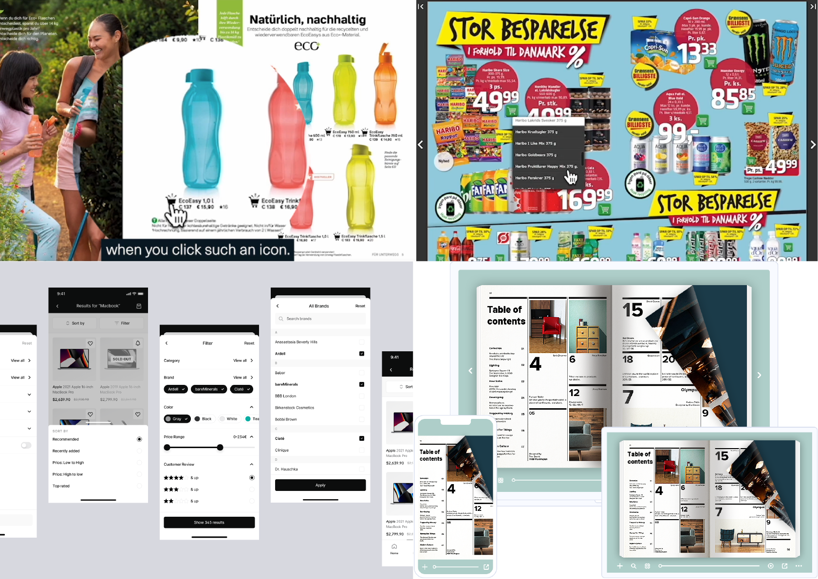
We conducted research to understand common pain points. Various research methods were undertaken to identify key issues, including competitor analysis, a heuristic evaluation and stakeholder interviews. Through these methods, it became evident that there were significant problems affecting the digital catalogue's performance.
Subsequent user research with current users revealed common pain points, validating insights for addressing business requirements and user needs effectively.
The analysis of the digital catalogue highlighted several performance issues, such as:
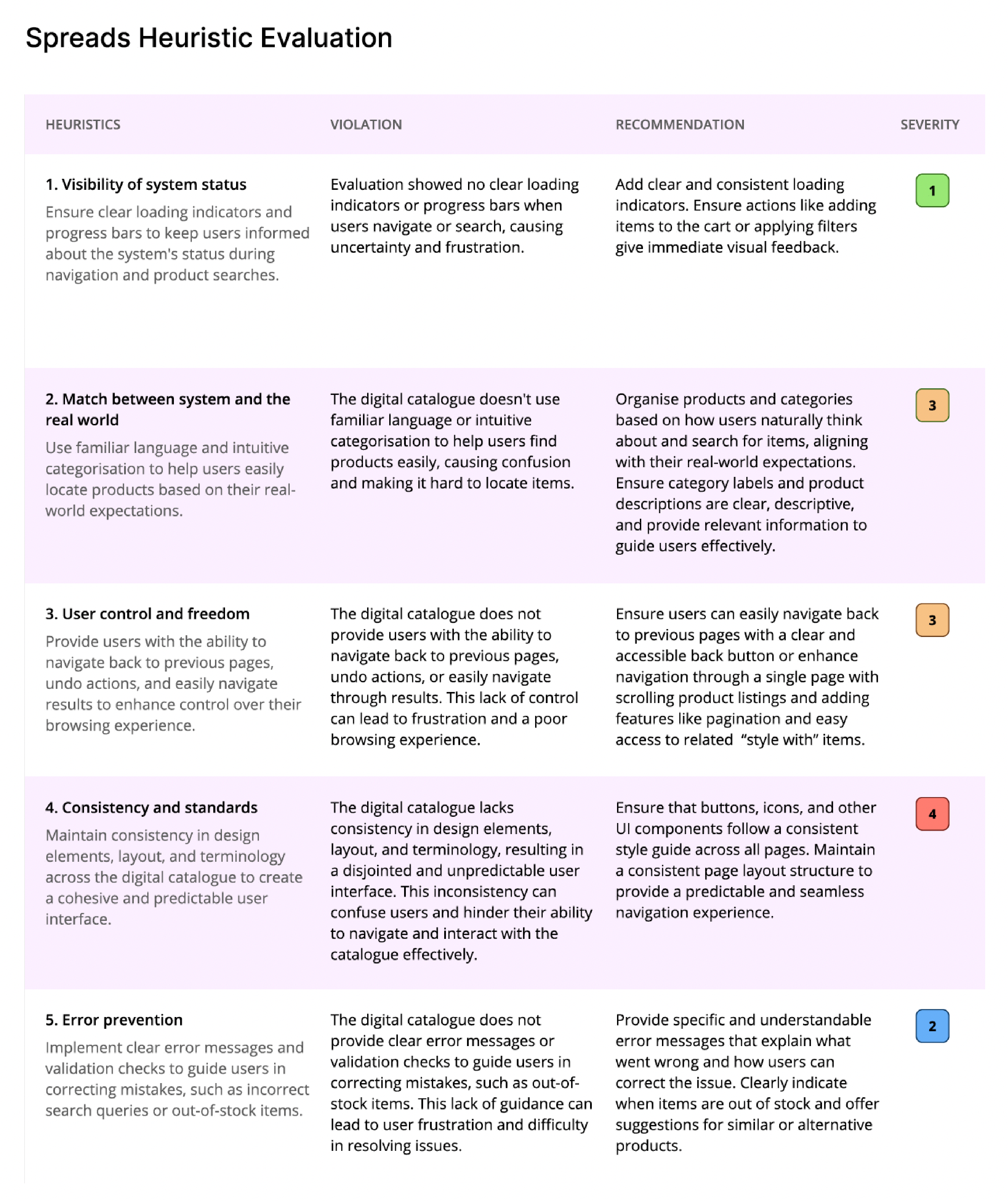
Our objective was to deliver a fresh and engaging shopping experience for customers by enhancing the creativity and intricate functionality of the whole system.
Using this empathy map helped us to understand the thoughts, feelings, actions and expressed needs of digital catalogue users, thereby informing the design of a more user-centric and effective shopping experience that addressed users’ concerns and enhanced overall satisfaction.
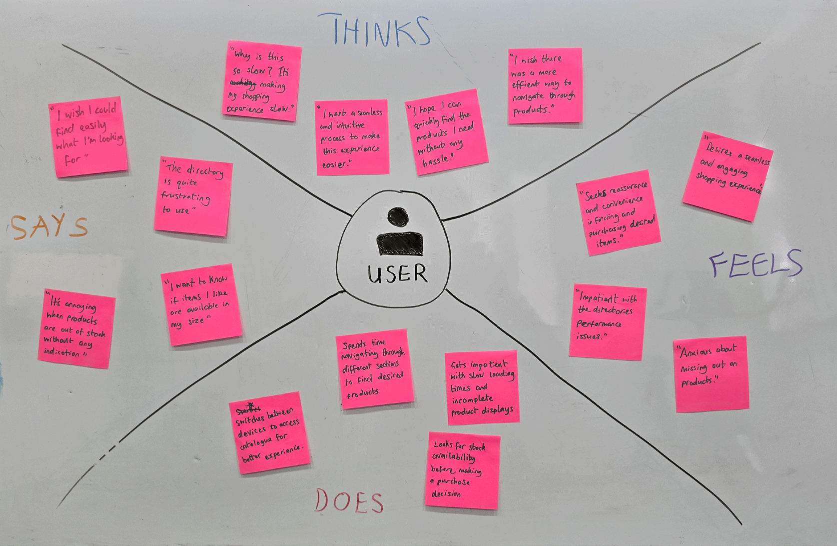
After thoroughly analysing the issues at hand, we reached a comprehensive understanding of the core problem. With this solid foundation, we were well-equipped to move forward with the ideation phase.
I began by brainstorming a wide range of potential solutions, leveraging our insights to generate innovative ideas that could address the identified challenges. This process involved collaborative sessions in which team members from different disciplines contributed their unique perspectives and expertise. I created some user journeys and sketched out initial concepts, created rough wireframes, and discussed various approaches to ensure we were considering all possible angles.
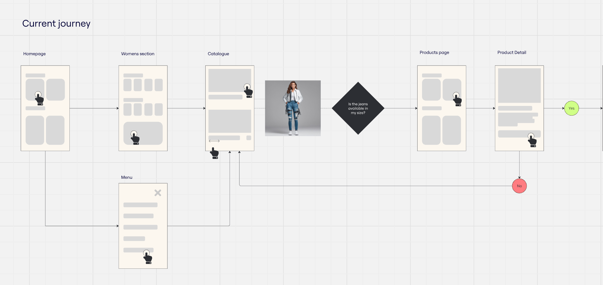
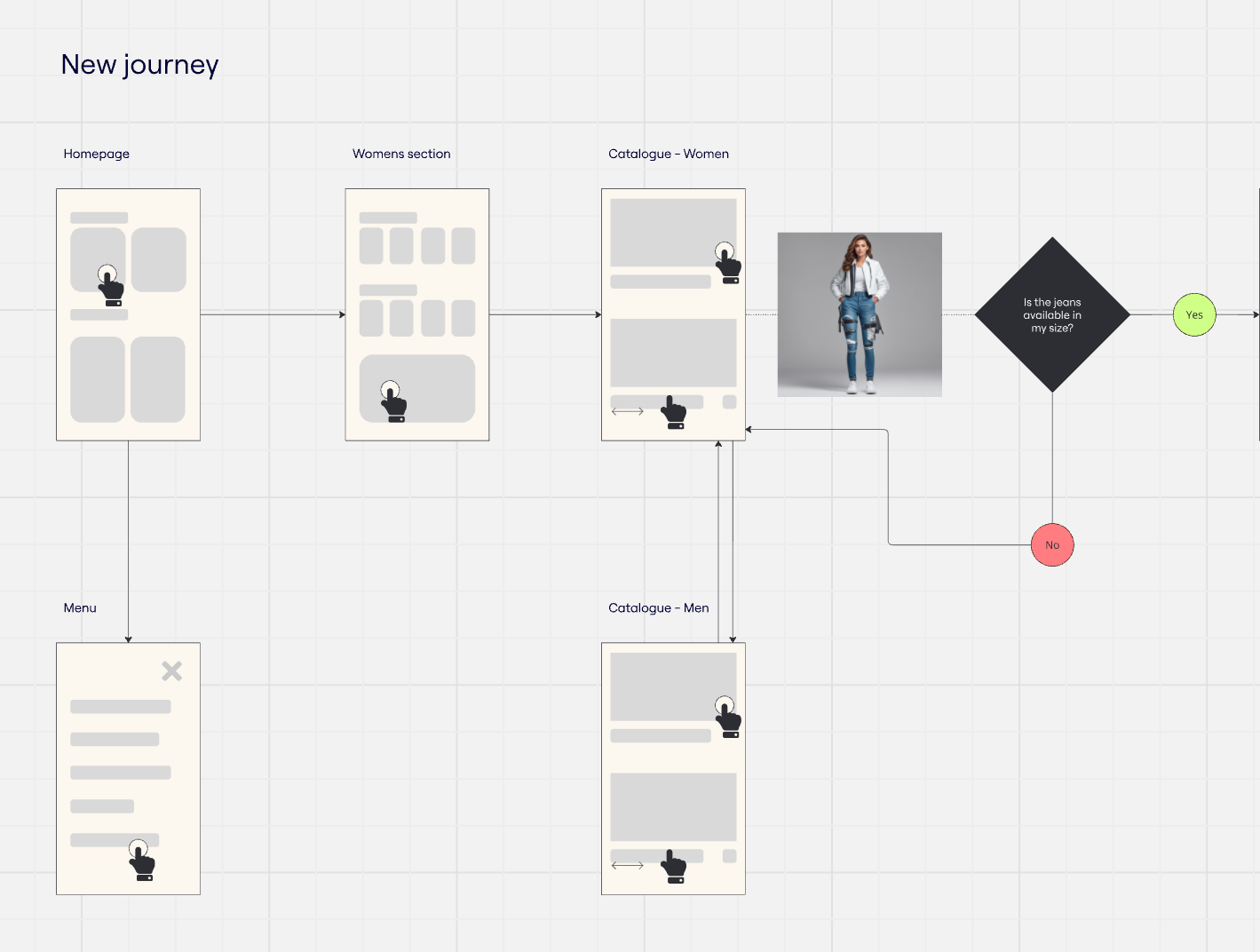
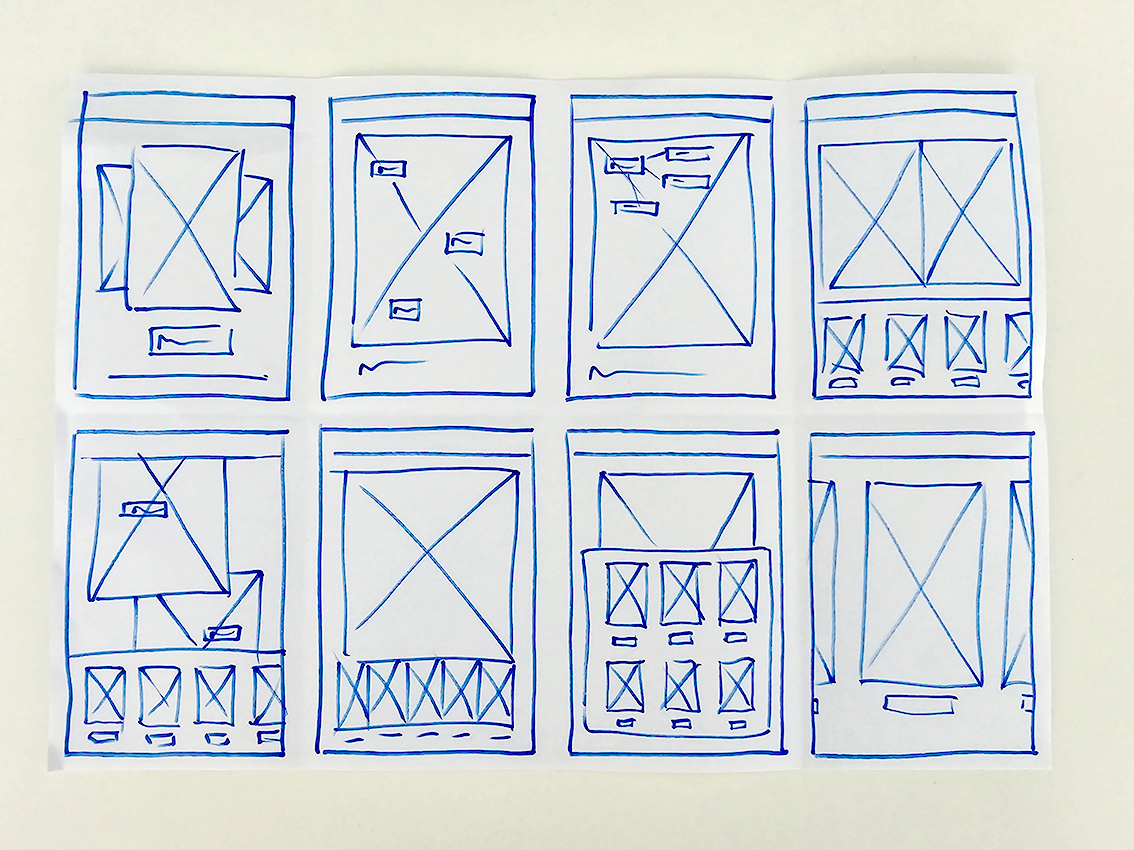
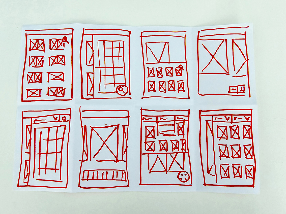
I explored ways to streamline the user journey, making it easier for users to move between different sections of the site without unnecessary backtracking. This included ideas such as a more intuitive menu structure and quick access links to popular categories.
Consistent user experienceAs a seamless experience across different devices was vital, I followed a responsive design solution to provide a consistent and enjoyable experience whether users were on a desktop, tablet or smartphone. The new design had to be scalable to accommodate other non-clothing products, such as furniture, and ensure users could also adapt to this new user experience.
Out-of-stock managementI explored solutions to improve the management of out-of-stock items, including providing clear notifications for reordering items and suggesting alternative products. Additionally, we discussed the possibility of implementing a feature that automatically replaced completely out-of-stock items with available alternatives.
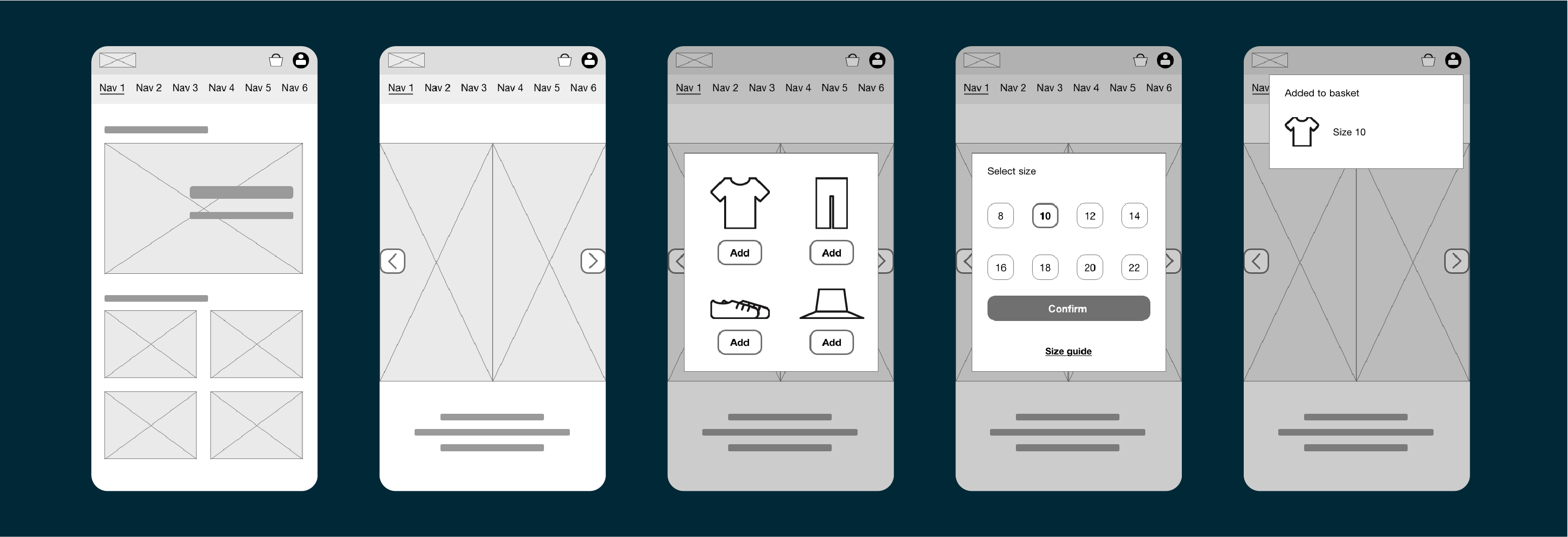
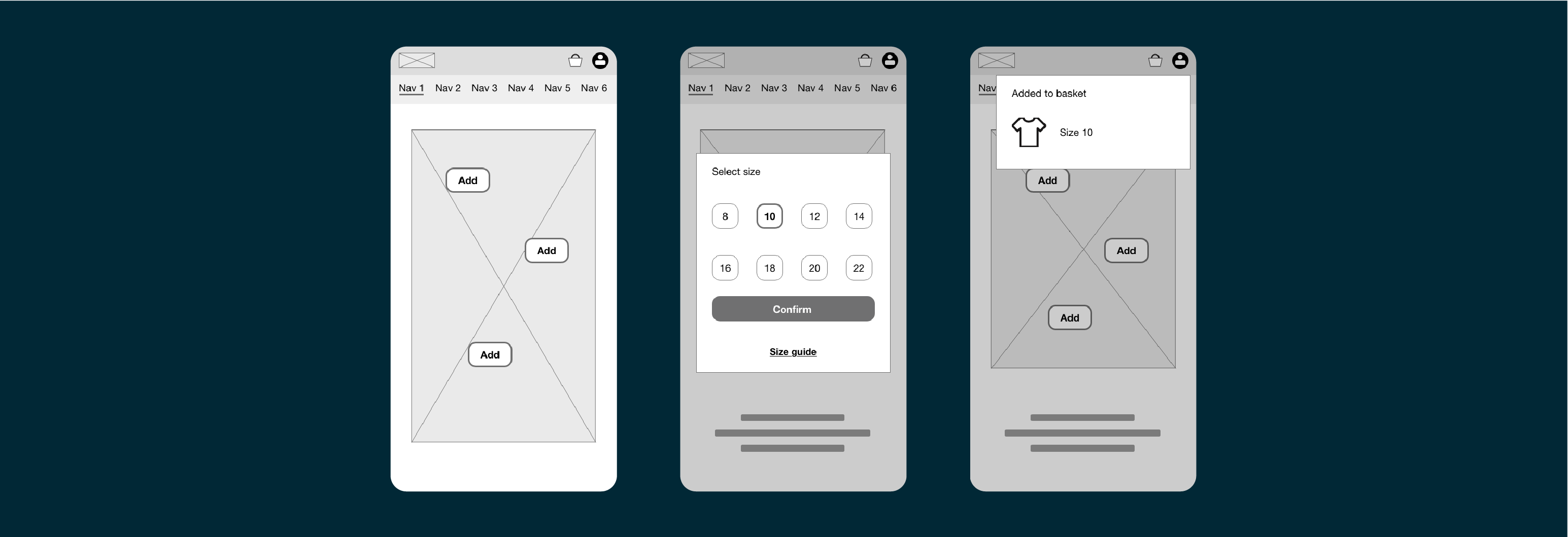
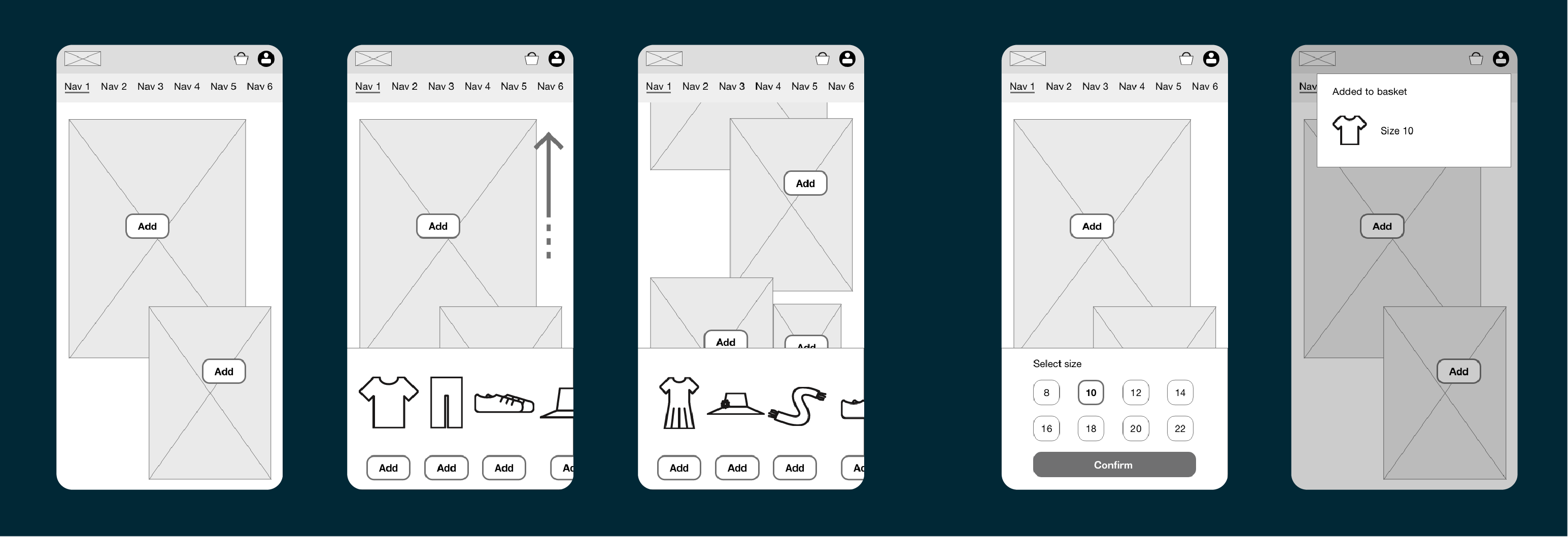
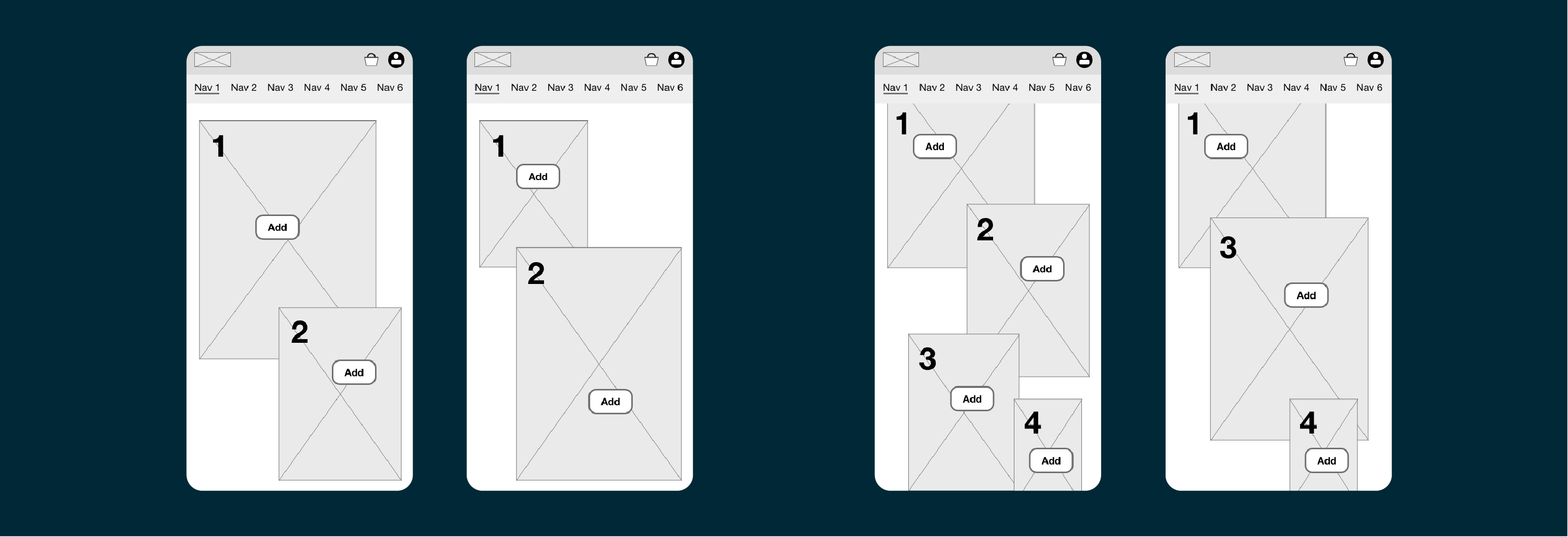
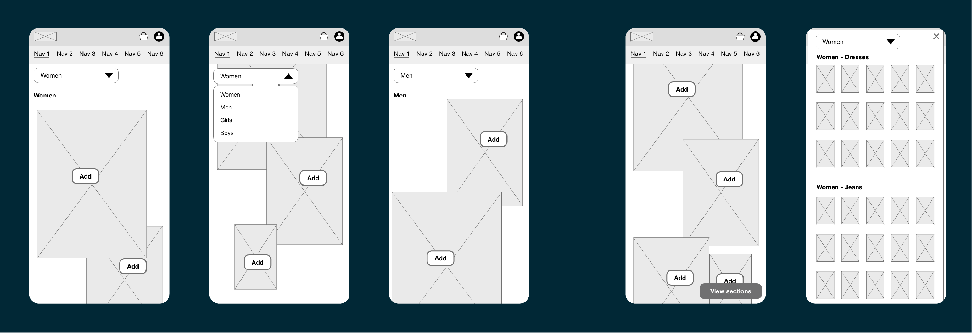
After creating concepts and wireframes, we focused on developing the new design system. This involved establishing consistent design elements, such as typography, color palettes, and component styles, to ensure a cohesive look and feel across the platform. The design system aimed to enhance usability and streamline the design process for the digital catalogue and future updates and features.
Some of the main areas I focused on included creating and refining the size and color selectors, typography, and developing a new component for the tray that slides in from the bottom. These elements were designed to improve user interaction and create a more seamless and engaging experience.
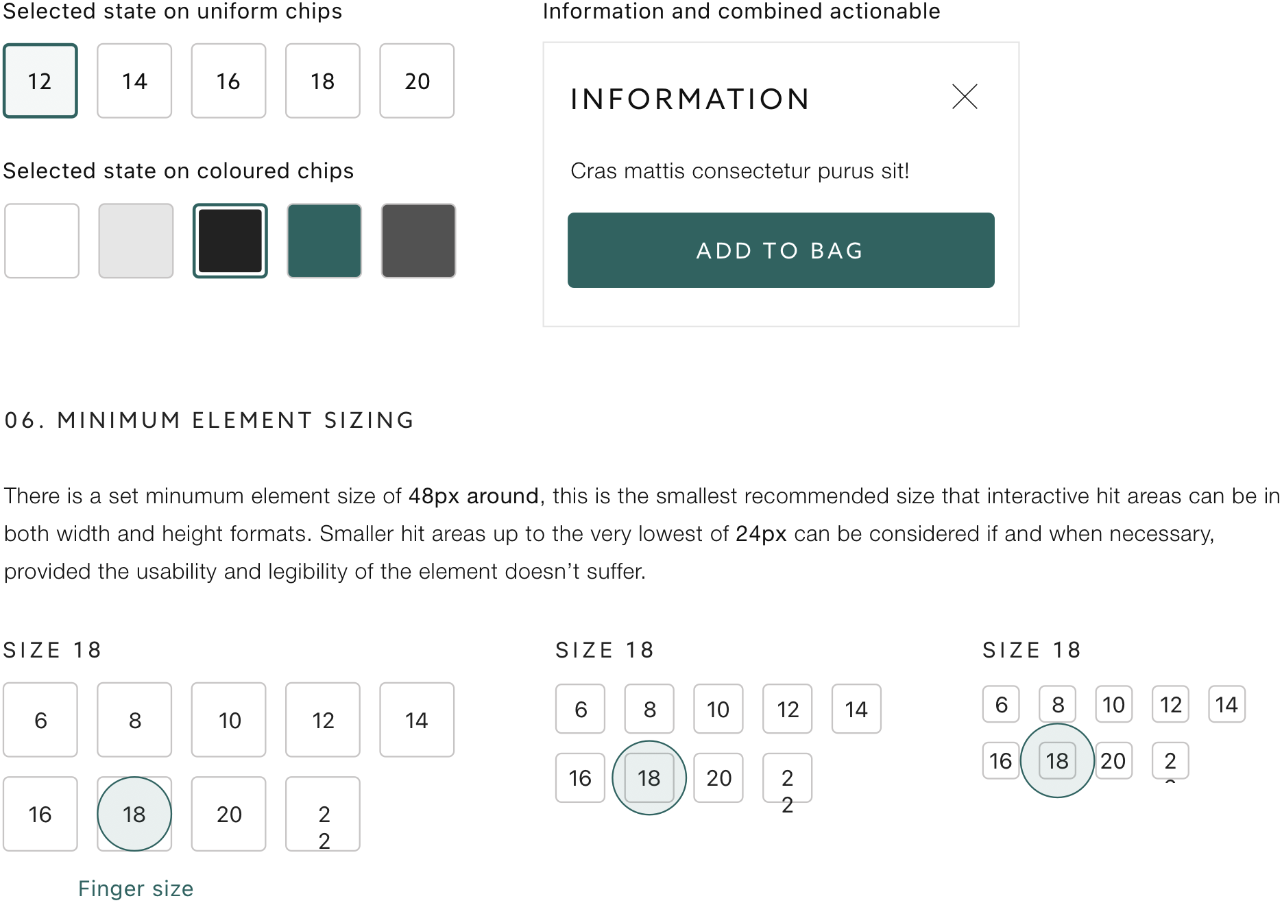
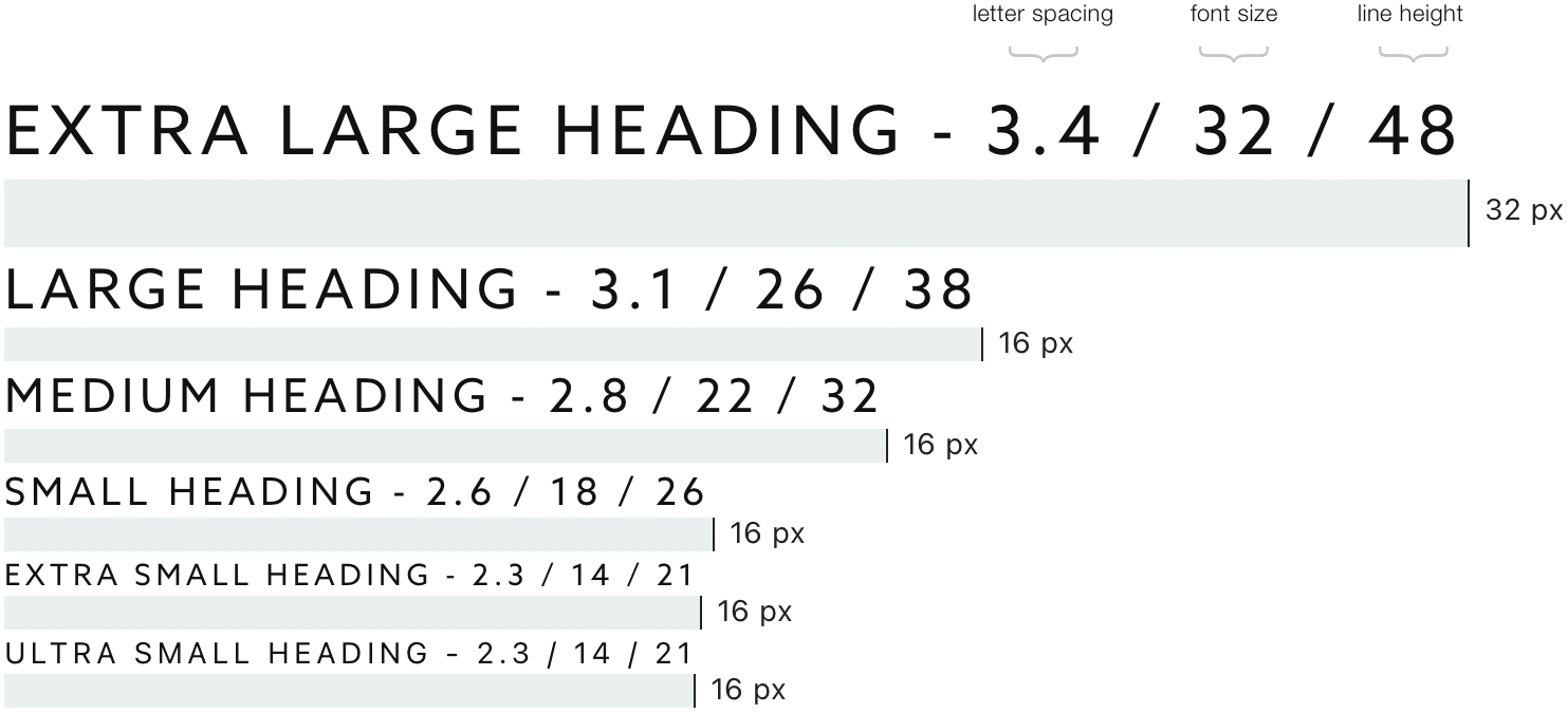
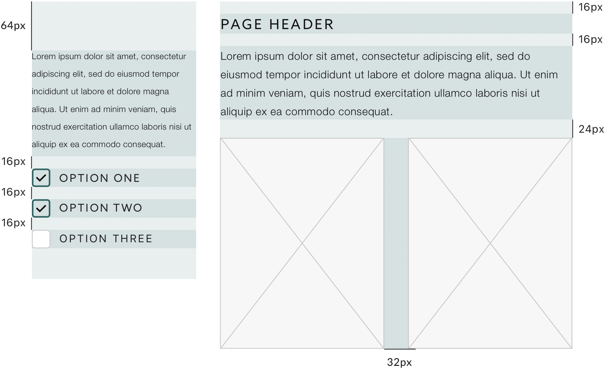

Building on the early conceptual work, design thinking, and discussions with stakeholders, I created detailed designs for several concepts. Two stood out as favourites: one mimicked the familiar flip-book style, the other used continuous scrolling.
One of the main challenges I faced was ensuring that the designs were detailed and functional on small mobile devices. The initial screen was designed to be simple and elegant, providing a clean user experience. However, when users interacted with the interface, modals would open, which took up valuable screen space. This created the need for a good balance of content with the limited real estate available on mobile screens, ensuring that users could still navigate easily without feeling overwhelmed or restricted by the design.
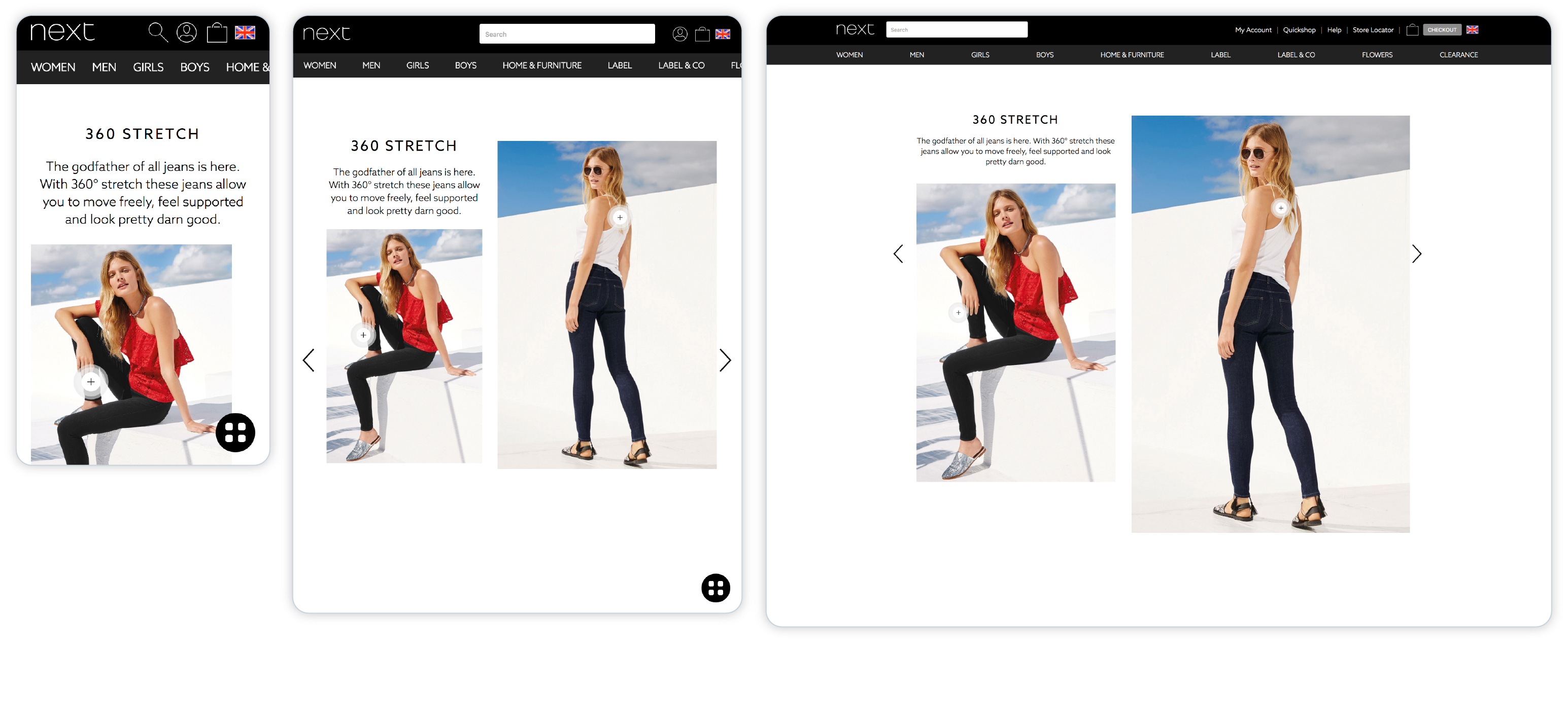
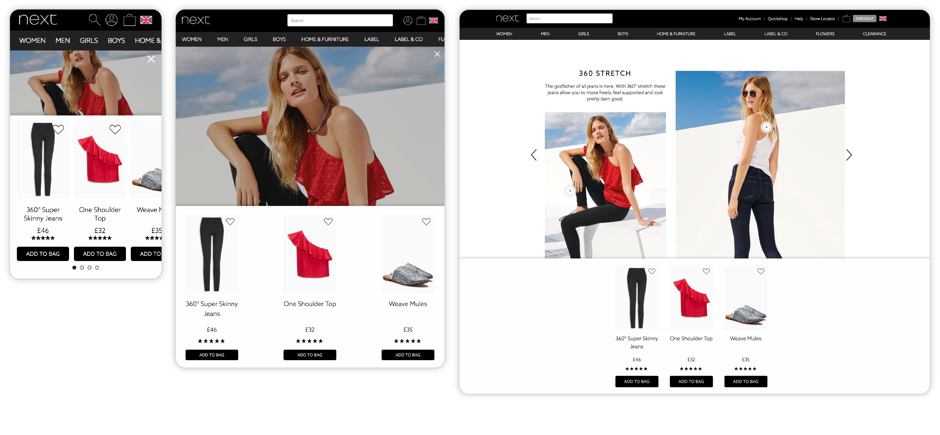
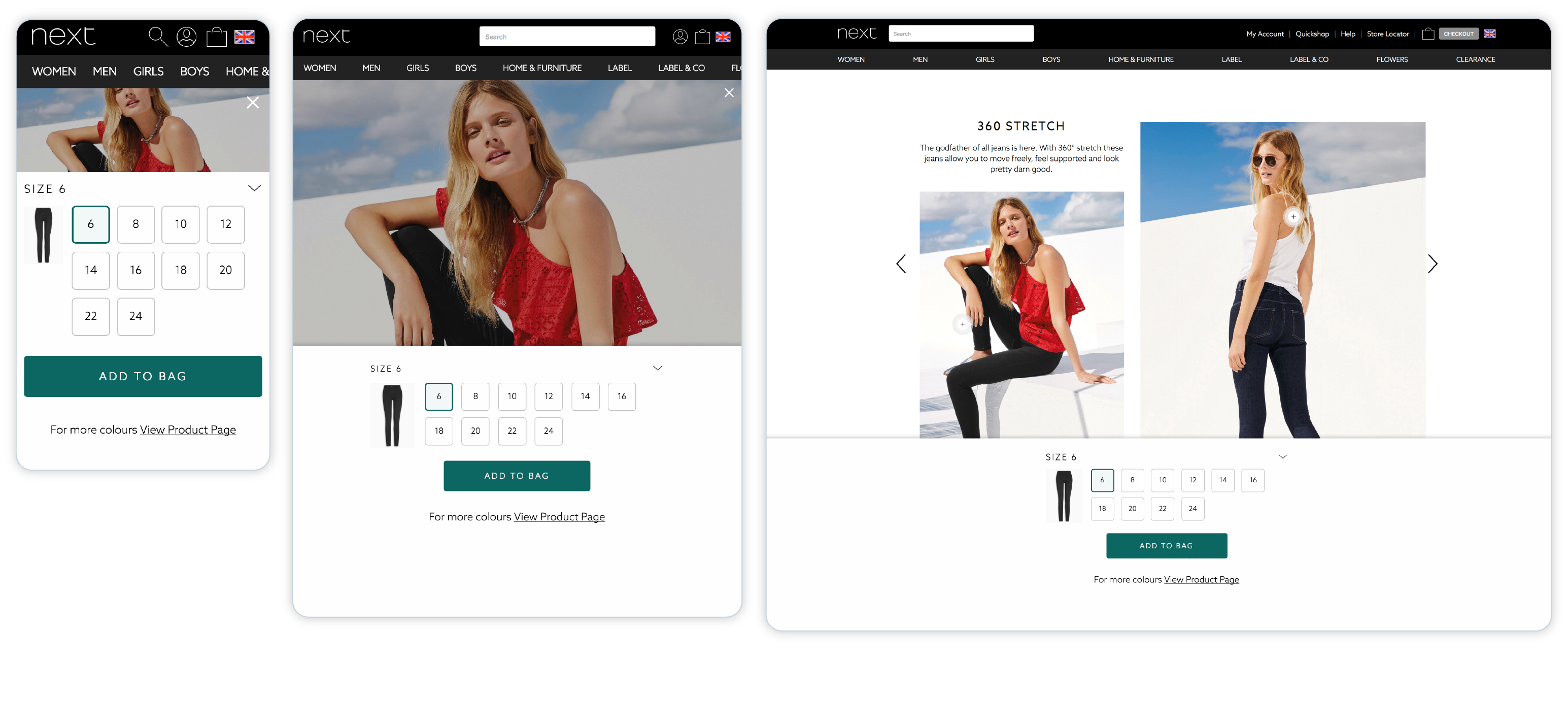
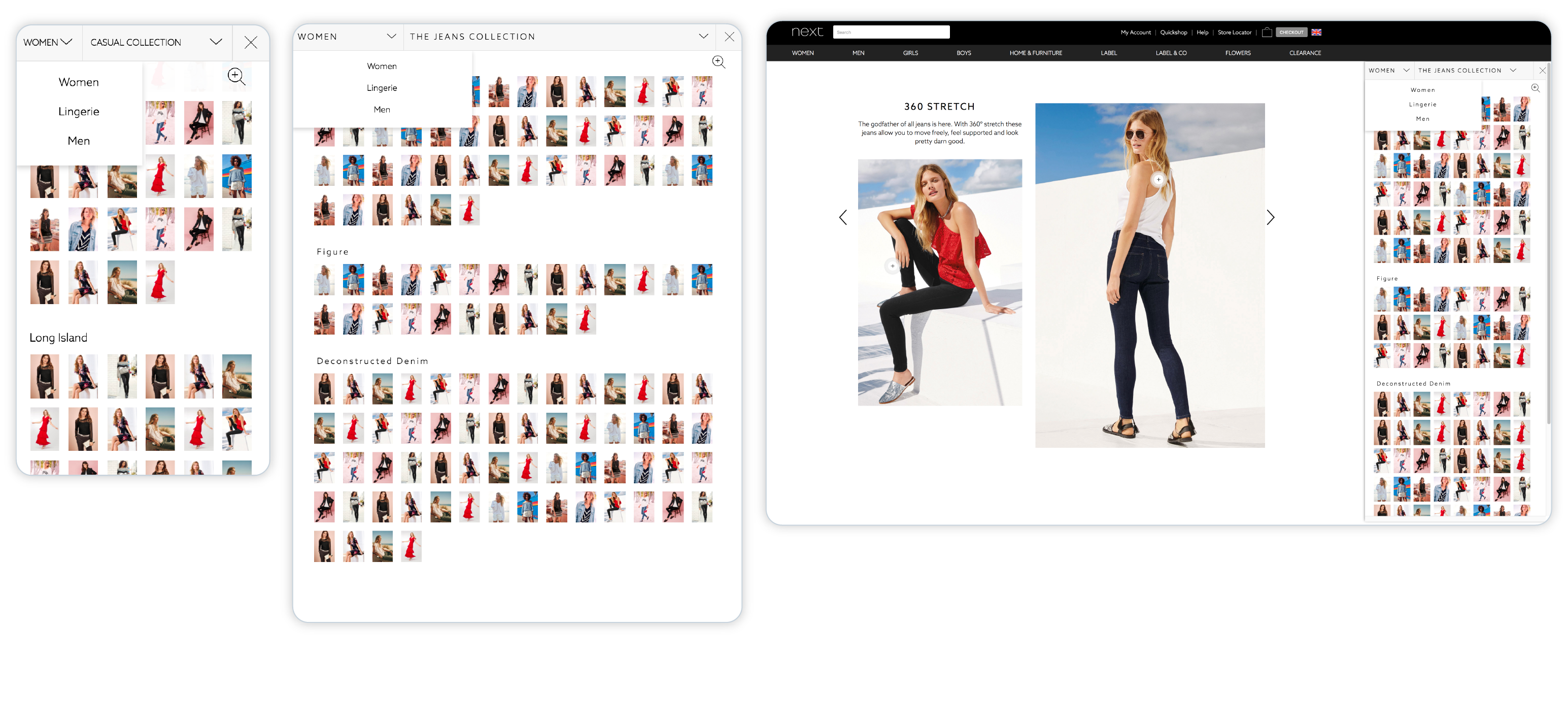
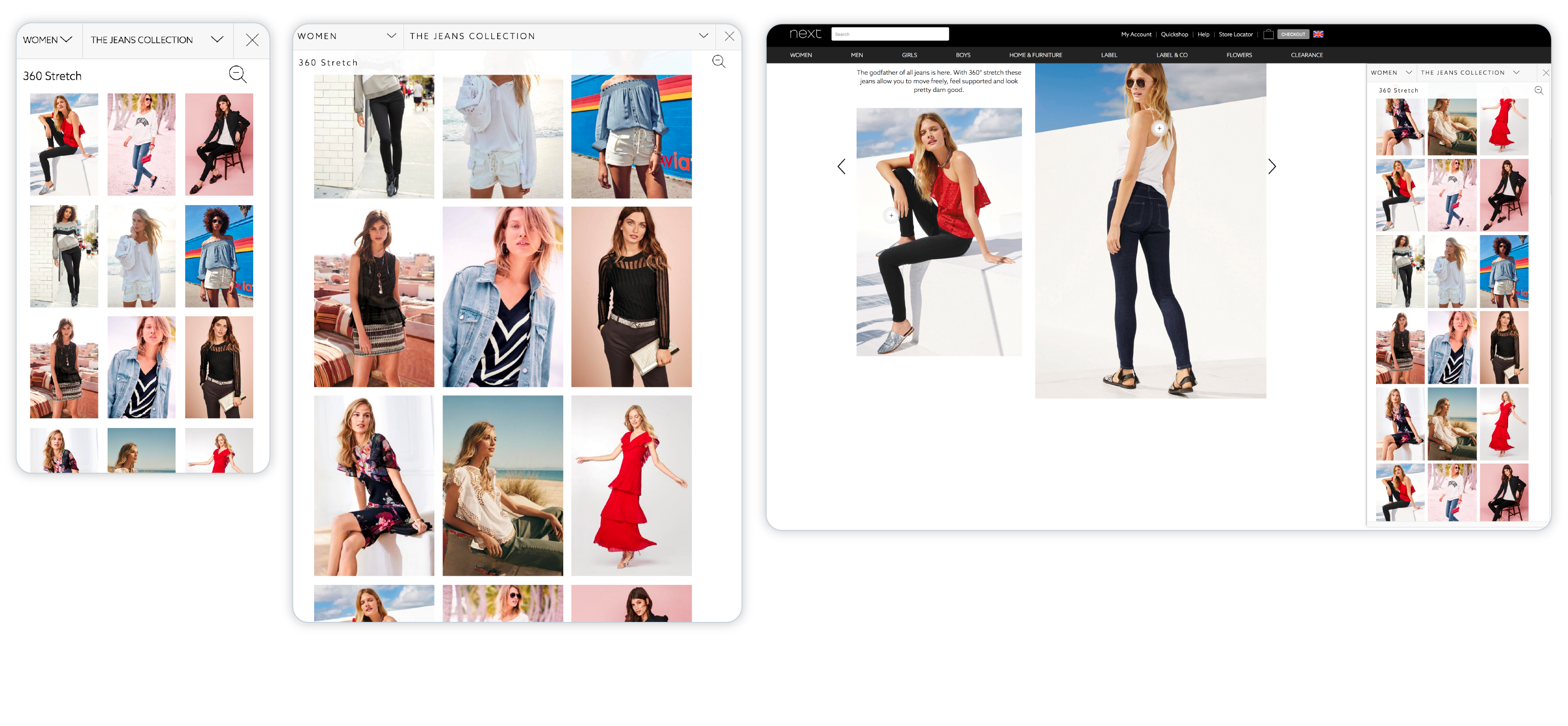
After creating some basic prototypes, it was clear that they were not adequate to effectively showcase some of the innovative ideas. There was a need for more realistic and polished prototypes that could better demonstrate the new design, features and functionality in a way that stakeholders and users could fully understand and appreciate. To address this, I developed a more sophisticated prototype which formed the basis of the final product, allowing for a more accurate representation of the user experience and the innovative elements being introduced.
One of the most valuable features for everyone involved was the implementation of a simple database using Tabletop.js. This plugin allowed us to effectively test various concepts, such as handling out-of-stock items and reordering products instantly. By integrating Tabletop.js, I was able to simulate real-world scenarios and interactions, providing a dynamic and responsive prototype. This capability was crucial in refining our thinking and ensuring that the features would work seamlessly in practice.
Based on analysis and user feedback following the introduction of the revised online catalogue, the findings were as follows: